Today, the website is the online face of the company. As we know, first impressions matter, and quite often the website is the first point of contact between a client and a company. The technological age means rapid changes, and many companies come to a conclusion that it is time to improve their website or even create a new one. This is a good decision, but how to do it right?
We have compiled a list of 7 important things to consider when creating a website:

Responsive website
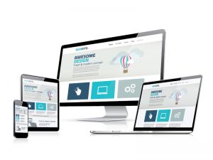
A responsive website means that the look of the website adapts to different screens – various computer screen sizes, smartphones and tablets. Statistics show that more and more people right now are browsing websites from their mobile devices rather than computers, therefore, responsivity is a must.
User experience
It is always important to know who is your customer and WHAT are they looking for on your website. This will help to create content that is meaningful for the user, as well as to ensure that the layout of all elements helps to easily find information. Users are lazy, they will not go through all sections of your website. If they are unable to find the information they need quickly, it is very likely they will move on to a different site and the analytics will show a high bounce rate.
Call-to-action buttons

When planning your website, it is important to understand its purpose. If one of the purposes is to get leads or sell goods, it is important to provide enough opportunities to click the Subscribe or Purchase button. Research shows that customers are always looking for a reason NOT to buy. So, you should give them enough counter-arguments to convince the customer to make the purchase or place the order, where the so called “Call-to-action” buttons can be very useful.
Visual appearance
The website should be visually appealing. Therefore, it is important to maintain a unified image style, text and layout. Even the little things like uneven placement of elements may sometimes turn off the potential customer. We like to have a nicely organized closet and accurately folded sweaters in the shelves. Likewise, we want to visit an appealing website without crowded text and blocks jumping all over the place.
Internal SEO
Quite often there are situations, where a new, visually appealing website is created and… the customer can’t find it on Google.
Just as goods should be neatly organized on the store shelves for the customers to find them, a website should be organized so as to allow the Google robots to find it and display it in the search results. This means that each website must have an organized internal SEO. You need the right meta tags, right titles for the images, texts with the right keywords and so on.
Website loading speed

Companies often do not think about this, but all users want to open the page quickly. If you have to wait for more than 2 seconds for the page to load, there is a very high probability that the users will leave the page. Time is value and no-one wants to waste theirs waiting for a website to load. Therefore, it is important to choose a powerful server (if the website is intended for foreign markets, it is worth considering purchasing a server in the target country) and use other tools that help ensuring quick loading times, for example, image weight optimization tools.
Testing
We highly recommend testing the website on all possible devices before its launch. The fact that the site looks nice on your computer screen, does not mean that it will look the same on a bigger screen or on a smartphone screen. Likewise, the site may look different on iPhone or Android systems. To prevent unpleasant surprises for your customers, test it thoroughly before launch or ask your colleagues, friends and acquaintances to help you out.
If you have any questions or you need a new, high-quality website, you are welcome to contact Angels

